JOULES
Little Joule Branding
OVERVIEW
As part of my role as Senior Digital Creative I created a captivating and child-friendly visual identity for Little Joule. The key elements that shaped this vibrant brand identity were:
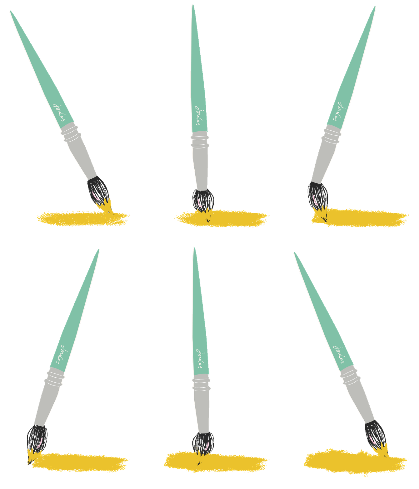
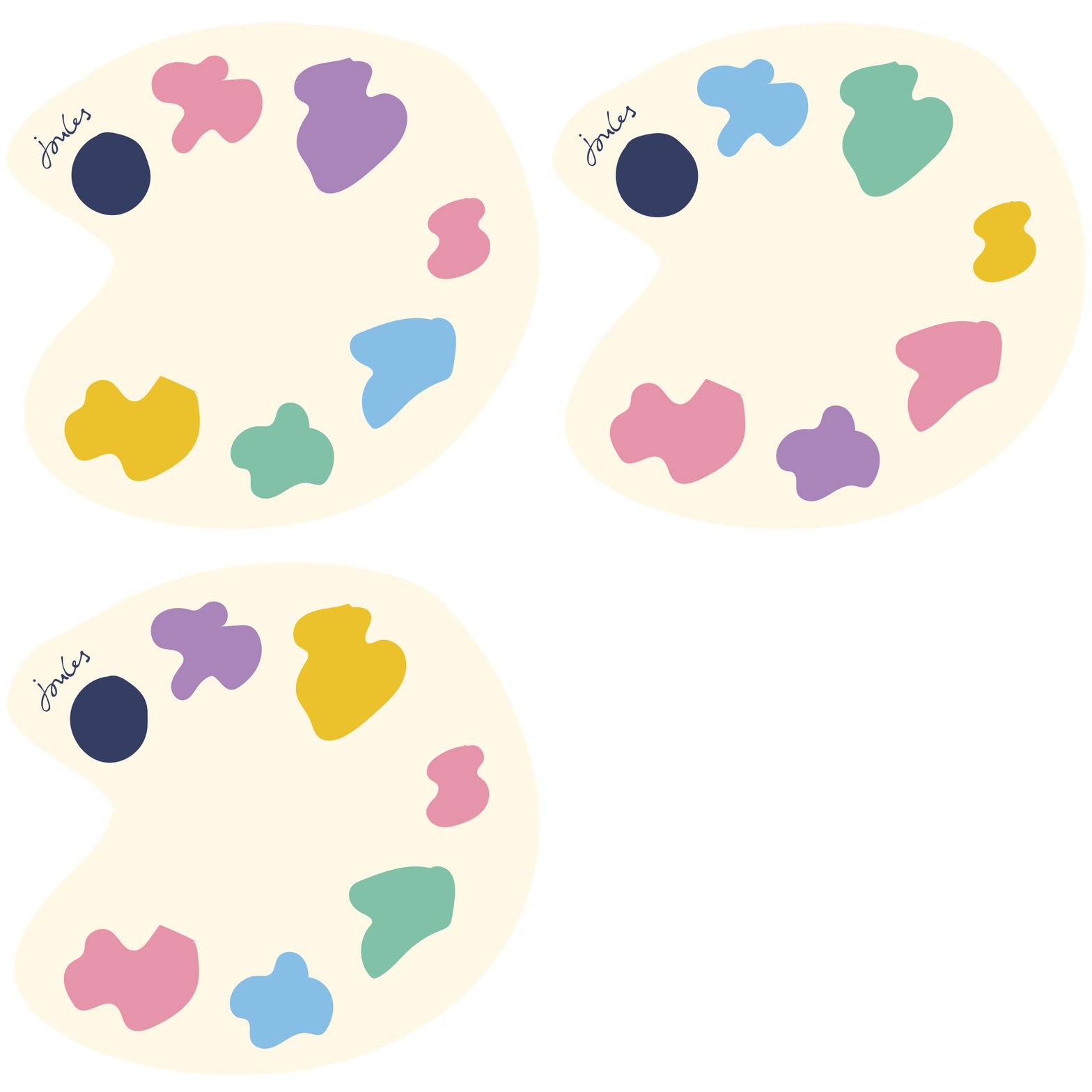
Playful Hand-Drawn Illustrations: To infuse a sense of playfulness and wonder into Little Joule's visual identity, I harnessed the charm of hand-drawn illustrations. These whimsical drawings served as the perfect complement to kids' photography, adding a delightful and youthful touch that resonated with the brand's essence.
Bespoke Childlike Typeface: One of the standout features of this project was the development of a bespoke typeface. Crafted in a childlike style, this unique font added a distinctive character to Little Joule's marketing materials. It was strategically reserved for simple layouts and photography, seamlessly integrating with the brand's identity.
Versatile Typography Approach: To strike a balance between whimsy and modernity, I implemented a versatile typography approach. When simple photography or illustrations were used, the bespoke childlike typeface took center stage. In contrast, when illustrations or busy photography were in use, clean and simple sans-serif fonts were introduced for contemporary layouts, ensuring that the brand maintained its playful appeal without appearing overly naive.
This project was designed to bridge imagination and design to create an endearing and relatable brand for children's fashion. It was a journey that celebrated the magic of childhood while adhering to the demands of modern branding.
ROLE
CAMPAIGN CONCEPT
BRANDING
ART DIRECTION
DIGITAL DESIGN


